Alfond Collection: Artists N-R
From Yoshitomo Nara to Francis Ruyter, explore the works of artists N-R in the Alfond Collection of Contemporary Art.
PLEASE NOTE: Not all works in the Rollins Museum collection are on view at any given time. View our Exhibitions page to see what's on view now. If you have questions about a specific work, please call 407-646-2526 prior to visiting.
Artists Featured in This Section
Yoshitomo Nara
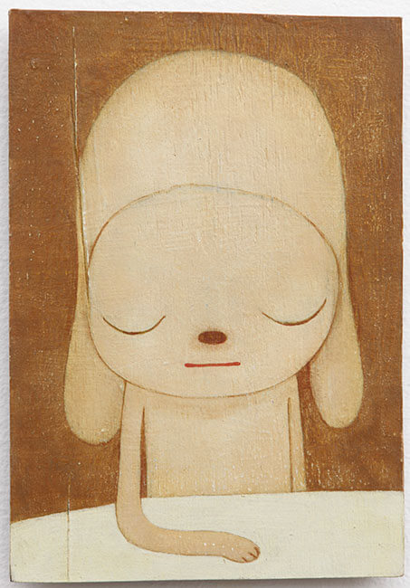
(Japanese, b. 1959)STAY, 2011
Acrylic on board
10 1/8 x 7 in.
The Alfond Collection of Contemporary Art, Gift of Barbara '68 and Theodore '68 Alfond, 2013.34.90. © Yoshitomo Nara. Image courtesy of the artist and Pace Gallery.
On the surface, the naively rendered cartoon characters that populate Yoshitomo Nara’s drawings, paintings, and sculptures seem sweet and innocent, but they are encoded with deep-seated anxieties about globalization and its effects on Japan. Nara came of age during the aftermath of World War II, when American culture flooded Japan. Nara’s generation of Japanese artists reflect on this phenomenon with ambivalence, using the New Pop idiom that they developed during the mid-1990s. Their styles clearly build on the Western Pop Art of the 1960s while integrating local sources such as Japanese animation (anime) and comic books (manga). Much like their Pop precursors, Nara and his peers use this low content to challenge the fixed boundary between high art and popular culture. The New Pop, however, is a distinctively Japanese response to the consumer excess associated with the country’s bubble economy. Formulating a national art style to match Japan’s new profile in the global marketplace was an urgent imperative, and Superflat—a label coined by artist Takashi Murakami to describe the shallow forms found in high art as well as media imagery—met this need.
--Sarah Parrish
Yoshitomo Nara
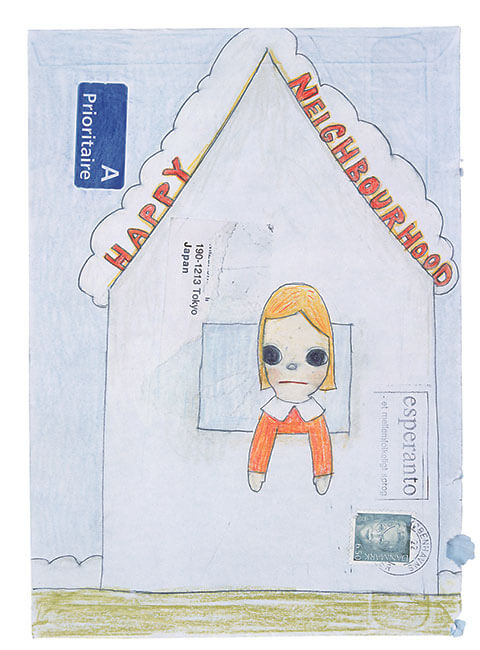
(Japanese, b. 1959)Untitled, 2003
Mixed media on envelope
8 5/8 x 6 1/4 in.
The Alfond Collection of Contemporary Art, Gift of Barbara '68 and Theodore '68 Alfond, 2013.34.89. © Yoshitomo Nara. Image courtesy of the artist and Pace Gallery.
Superflat in general, and Nara’s work in particular, celebrates Japanese mass culture while also offering a critique of it. Nara’s children and animals epitomize the Japanese concept of kawaii—the idealization of childhood, cuteness, and sweetness that masks the darker realities of contemporary life. The critical edge of kawaii is evident in paintings like STAY (2011), which depicts a glum puppy obediently following the command implied by the piece’s title. If this painting thematizes the ideas of control and stasis, mobility is the subject of his untitled drawing of a wide-eyed blond girl leaning out of the window of a simple house labeled “Happy Neighbourhood.” Marshall McLuhan’s phrase “global village” would be an equally apt caption, since the drawing is doodled on an envelope bearing French, Danish, and other postal markings that suggest the child’s uprooted, nomadic existence. Both this drawing and STAY are affirmative as well as critical, proposing a distinctly Japanese aesthetic that holds its own against the encroaching sameness of globalization.
--Sarah Parrish
Shirin Neshat
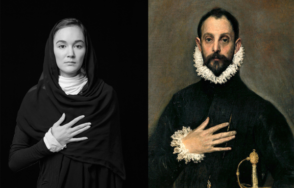
(American, Iranian, b. 1957)In Deference, 2018
Dye-sublimination on aluminum
25 9/16 x 40 in.
The Alfond Collection of Contemporary Art, Gift of Barbara '68 and Theodore '68 Alfond, 2018.1.23. Image courtesy of the artist.
Since 1993, contemporary Iranian artist Shirin Neshat has been creating a unique body of work, primarily featuring black-and-white photographs and films that analyze Islamic culture and political conflict through a feminist lens. The artist’s break-out series, “Women of Allah” (1994) appropriated the motif of the gun juxtaposed with images of women and overlaid with Arabic calligraphy to criticize violence and traditional gender roles in the Islamic world. This new work also takes on gendered Western perceptions of the Middle East by appropriating a painting by Spanish artist El Greco (1541-1614) in a diptych format. Neshat’s model, in traditional Iranian dress, exactly mimics the Spanish nobleman’s gesture, pose, and expression, inviting reflection on our differing perceptions of the two figures. Asserting her own Middle Eastern, female perspective, Neshat encourages us to consider persisting Orientalist sentiments in the West.
Shirin Neshat
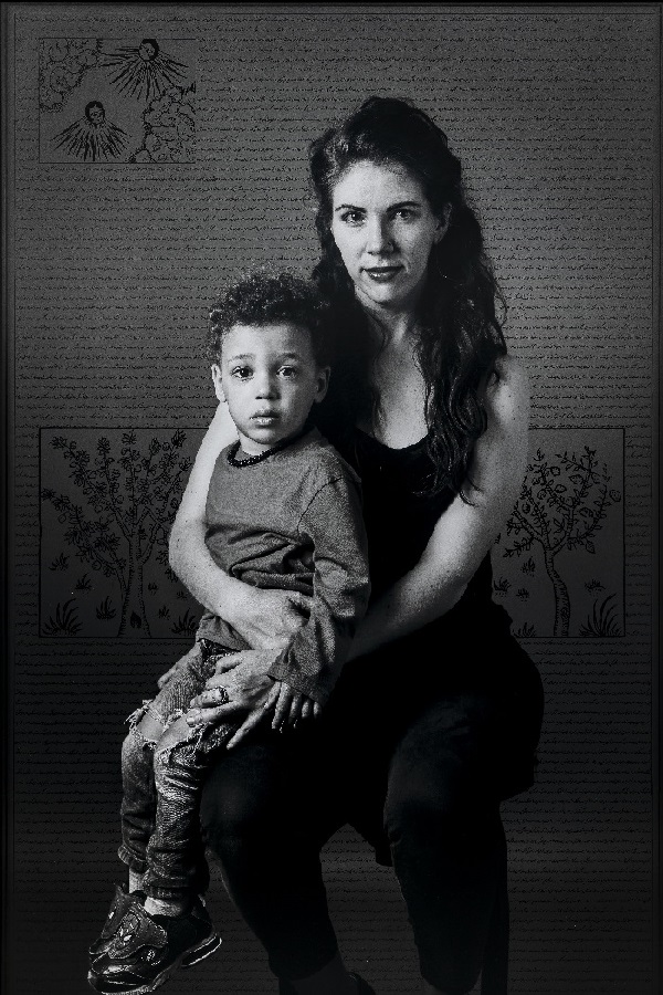
(American, Iranian, b. 1957)Magali & Phoenix, 2019
Digital c-print with ink and acrylic paint
60 x 40 in.
The Alfond Collection of Contemporary Art, Gift of Barbara ’68 and Theodore ’68 Alfond, 2021.1.5. Image courtesy of the artist and Gladstone Gallery, New York
Shirin Neshat
(American, Iranian, b. 1957)My Beloved, 1995
Silver gelatin print and ink
45 1/4 x 65 1/4 in.
The Alfond Collection of Contemporary Art, Gift of Barbara '68 and Theodore '68 Alfond, 2015.1.49 Image courtesy of the artist and Gladstone Gallery, New York and Brussels
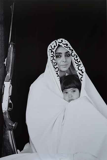
Shirin Neshat, a filmmaker and photographer, lived in Iran from birth until 1975. Her departure from Iran was followed by turmoil in her home country, first as a result of the Iranian Revolution (1979–80) and then the Iran–Iraq War (1980–88). A return to Iran after an extended absence inspired her to create work that interrogates the construction of identity of women from Iran. Neshat’s work blurs lines of authority and agency as she challenges Western notions of women from the Middle East. This photograph, taken just two years after she began taking photographs, is one of the 38 works in the artist’s series Women of Allah. Made in 1995, My Beloved, a self-portrait with her son, epitomizes the artist’s approach to both aesthetic and content at this point in her career: the high contrast between black-and-white, the presence of calligraphy, and the inclusion of a rifle manufactured by Remington, an American company founded in 1819.
Kenneth Noland
(American, 1924-2021)Untitled, Paris #4, 1981
Handmade paper
16 x 16 in. each
The Alfond Collection of Contemporary Art, Rollins Museum of Art. Gift of Barbara ’68 and Theodore ’68 Alfond. 2021.1.14 © 2022 Kenneth Noland / Artists Rights Society (ARS), New York
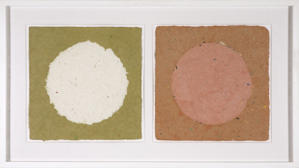
Born in Asheville, North Carolina, Noland’s artistic talents were evident from a young age. After serving in the Air Force during World War II, Noland studied art at Black Mountain College in 1946 and was inspired by the geometric compositions and colors utilized by modern artists Piet Mondrian and Paul Klee. As Noland’s career continued into the 1960s, he began producing major works that contributed to the Color Field Movement, which favors abstract fields of color over narrative or symbolic content. In the 1970s, Noland experimented with handmade colored paper as the foundation for his paintings to explore how these works could be perceived as sensations rather than art objects. In Untitled, Paris #4, Noland paints large, dark circles that rest atop colored paper, emphasizing the physicality of the material and unifying the composition.
Kenneth Noland
(American, 1924-2021)Untitled, Paris #13, 1981
Handmade paper
16 x 16 in. each
The Alfond Collection of Contemporary Art, Gift of Barbara ’68 and Theodore ’68 Alfond. 2021.1.15 © 2022 Kenneth Noland / Artists Rights Society (ARS), New York
Monte Olinger
(American, b. 1958)St. John's Sunset, 2012
Acrylic wash and mixed media on canvas
48 x 36 in.
The Alfond Collection of Contemporary Art, Gift of Barbara '68 and Theodore '68 Alfond, 2013.34.5. Image courtesy of the artist.
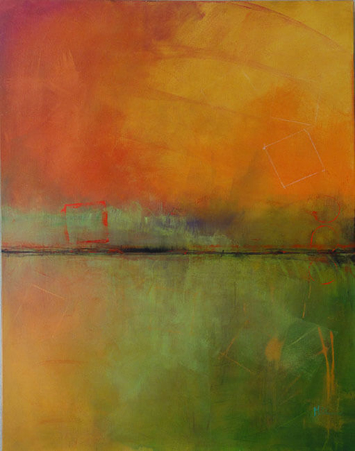
Monte Olinger was raised in a family of artists and art teachers; he grew up with painting as a way of life. Not long after he finished his master’s degree in Interior Design at the College of Visual Arts at Florida State University, he began to develop symptoms of a neurological movement disorder called dystonia. Because of the physical limitations of his condition, he taught himself to paint with both hands to expand his options.
For someone like Olinger, whose body is capable of bringing him great pain at times, art-making can become a process of finding a way back to pleasure. These positive experiences balance the score and make living a worthwhile pursuit even in the face of great challenges. The creative process is a spiritual and emotional journey, and therefore promotes healing and overall wellness. Painting is Olinger’s form of therapeutic self-expression.
Art therapy is used to help adults and children suffering from a broad range of physical and mental health issues. It works in a number of different ways, depending on who is making art and why. The art process can be used to facilitate expression when words fall short, it can help to clarify or unearth parts of the self by reflecting back images from the unconscious, and it can shift or energize the psyche by tapping into different areas of the brain to create new neural pathways. Throughout our lives, we experience an enormous amount of visual stimuli, and the human brain stores much more of that information than we are consciously aware. Visual expression of imagery serves to explore and map the uncharted territory of the brain.
For Olinger, the creative process is a visceral liberation; he gets lost in an energetic release. This emotional experience is actually quite grounding, particularly when his body is limited. When his right hand is affected by physical symptoms, Olinger works abstractly and makes use of his left hand, thus engaging more of his brain for unconscious imagery to emerge. As Olinger himself explained, he has "figured out a way to use the rhythm of the tremors" to create lyrical and sensual paintings. At that moment, personal pain is transformed into shared beauty.
--Jennifer Ziefert
Paulina Olowska
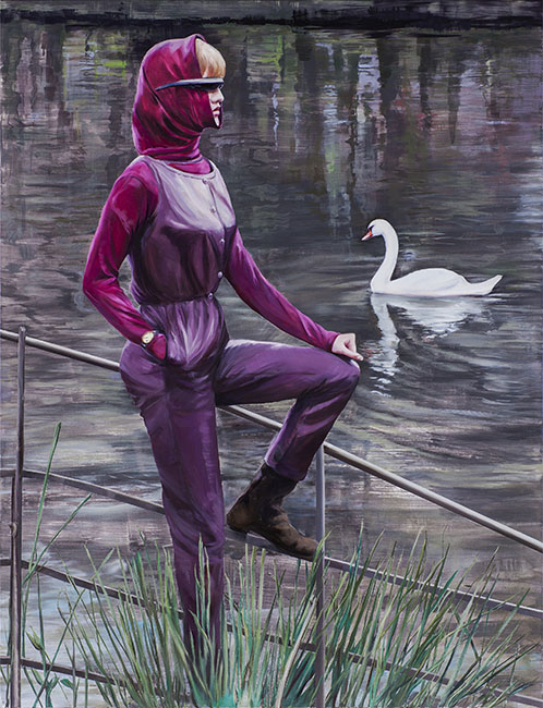
(Polish, b. 1976)The Swan (after Norman Parkinson Foundation), 2017
Oil and acrylic on canvas
86 5/8 x 66 7/8 in.
The Alfond Collection of Contemporary Art, Gift of Barbara '68 and Theodore '68 Alfond, 2017.6.58. © Paulina Olowska
Julian Opie
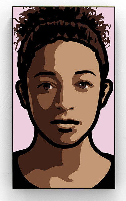
(British, b. 1958)Imogen, 2013
Computer animation video
48 x 27 1/4 x 4 1/4 in.
The Alfond Collection of Contemporary Art, Gift of Barbara '68 and Theodore '68 Alfond, 2014.1.1. © 2015 Julian Opie. © Julian Opie / Artist Rights Society (ARS) New York . Image courtesy of Barbara Krakow Gallery, Boston
Julian Opie’s oeuvre is often contextualized with pop art, as he has become well known for his vibrantly colored, comic book–like depictions of his subjects. Yet his work dodges easy art historical categorization, especially since he began his first animations in the late 1990s. Using digital technology to imbue his graphics with motion, Opie has been exploring the power of the moving image in the visual language of minimalism.
Opie works in a geometric style, utilizing strong outlines and a limited color palette. He uses lines to demarcate eyebrows and dots to define eyes and nostrils; some of Opie’s portraits contain even less detail, providing almost as little visual information as a silhouette. Imogen, however, signifies a departure from such sparse representation. Created in conjunction with a body of work that included mosaics and three-dimensional busts, Imogen indicates a turn to more traditional forms of representation. Opie’s signature black lines frame the girl’s face, but the different shades of brown that fall in vertical registers serve as shading and hint at three-dimensionality. The tight cropping of Imogen’s face and neck mimic a classical bust and suggest the merging of historical, even ancient, styles with minimalist form.
At the same time as Opie looks to the past, however, he also engages the present. Through his employment of digital animation, Opie highlights his cognizance of the complexities that result from the rise of technology in our global community. Against a blank backdrop of purplish-pink, Imogen seems to exist in a void, perhaps the virtual space that often occupies the attention of contemporary society. Despite the fact that Imogen’s portrayal contains more details than earlier examples of Opie’s works, her image is still distilled. Yet viewers can recognize her unique features and gain a quick understanding of her likeness. Opie reminds us that in today’s world, where advertisements, digital technologies, and flashing visuals provide constant stimulation, one only looks at images long enough to retain the most basic level of comprehension. However, the young girl breaks out of her role as motionless subject through subtle changes in expression. The corners of her lips move slightly every few moments, and her countenance fluctuates between one of indifference and one of contentment. Opie destabilizes the traditionally static presence of a portrait-sitter and prompts viewers to re-evaluate their perceptions of his subject.
Opie harnesses technology to draw attention to its dual effects—connecting individuals while simultaneously detaching them from their surroundings. Yet Imogen’s slow, delicate movements ultimately invite spectators to linger. Opie suggests that certain things in the fast-paced tempo of everyday life require close study rather than a passing glance.
--Adrien Gates and Laura Beshears
Julian Opie
(British, b. 1958)People. 9. Coloured., 2015
Continuous computer animation on a 22" LCD screen
15 45/64 x 15 45/64 x 4 19/64 in.
The Alfond Collection of Contemporary Art, Gift of Barbara '68 and Theodore '68 Alfond, 2015.1.43. © Julian Opie / Artist Rights Society (ARS) New York. Image courtesy of Lisson Gallery, London and New York
Eamon Ore-Giron
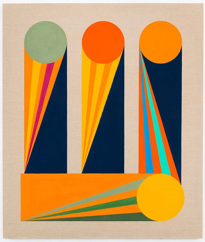
(American, b. 1973)Roman Blues 1, 2015
Flashe on linen
66 x 56 in.
The Alfond Collection of Contemporary Art, Gift of Barbara ’68 and Theodore ’68 Alfond. 2020.1.19 © Eamon Ore-Giron
Born in Arizona, Eamon Ore-Giron explores in his work a multiplicity of cultural referents, traditions, and materials. Informed by a wide range of historical legacies—from indigenous and Latino to classical European and modern avant-garde—Ore-Giron's visual language speaks to the confluence of form and content. His paintings bring together the timelessness and universality of geometric shapes while integrating the formal characteristics of artistic traditions from divergent time periods and regions. As is characteristic of his style, in this painting, shapes, lines and colors create a dynamic composition full of energy and movement. The title refers to each of the vertical forms, which the artist identifies as evoking the Roman numeral III, while at the same time referencing ancient columns and classical architecture. Inspired by the work of Brazilian artists Hélio Oiticica and Lygia Clark, this painting is part of an ongoing series that weaves together visual and historical elements.
Eamon Ore-Giron
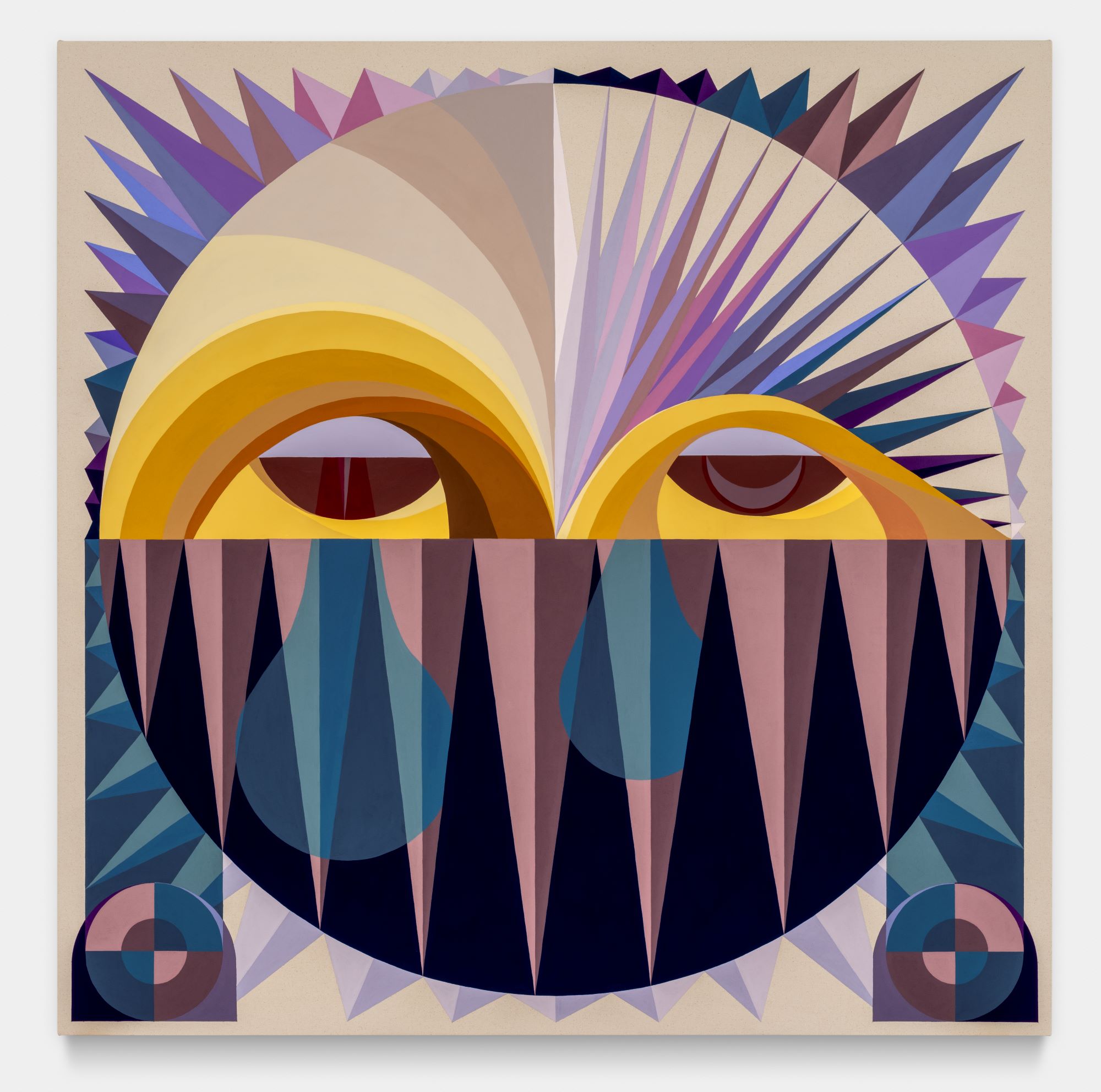
(American, b. 1973)Talking Shit with Mama Killa, 2023
mineral paint and Flashe on canvas
72 x 72 x 1 1/2 in
The Alfond Collection of Contemporary Art, Rollins Museum of Art. Gift of Barbara '68 and Theodore '68 Alfond, 2023.1.27 © Eamon Ore-Giron, 2023. Courtesy of the artist and James Cohan, New York
Eamon Ore-Giron is an American artist whose brightly colored abstract geometric paintings synthesize formal histories to explore the cross-cultural influence. Combining motifs and symbols drawn from sources that span geographies and time, Ore-Giron redefines traditional figures through his own lens. Throughout his exhibition Talking Shit, Ore-Giron creates imagined conversations between himself and deities from Mexico and Peru’s ancestral past. This painting reimagines Mama Killa, the Incan goddess of the moon and menstrual cycles. This goddess is represented as a circular shape with pointed spikes that create a texturized appearance. The layering of colors and shading produces an illusionary projection of the goddess from the canvas that allows her to confront the viewer. As in many of his paintings, Ore-Giron uses shapes, lines, and colors to create a dynamic composition full of energy and movement.
Rubén Ortiz-Torres
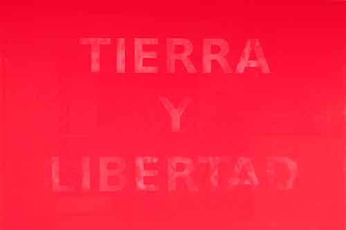
(Mexican, b. 1964)Toma de Tijuana, 2013
Urethane and thermochomic pigment on resin
48 x 72 x 12 13/64 in.
The Alfond Collection of Contemporary Art, Gift of Barbara '68 and Theodore '68 Alfond, 2016.3.2. Image courtesy of the artist and OMR Gallery, Mexico City.
Rubén Ortiz-Torres uses the ubiquitous phrase “Tierra y Libertad” (Land and Liberty) which appeared in banners, photographs, and murals related to the Mexican Revolution (1910–20), in a new context with this Minimalist work. A battle cry for the people, this potent slogan became associated with the Mexican revolutionary Emiliano Zapata, who fought for agrarian reform. However, more specifically the artist evokes Ricardo Flores Magón here and “the anarchist political slogan hoisted above Tijuana in the early twentieth century.” Flores Magón founded the Mexican Liberal Party (Partido Liberal Mexicano, or PLM) in 1905. Some of his followers led an insurrection in Baja California in 1911 that led them to briefly control cities such as Tijuana and Mexicali. Here, Ortiz-Torres’ title, Toma de Tijuana, refers to that history.
In this work, Ortiz-Torres embraces Minimalism, but through his own distinctive translation of this artistic movement. The bright-red hue of the work emphasizes the bold and direct intention of the original slogan as a political statement that represented the landless people and galvanized the working classes in both rural and urban settings. But the letters do not mimic the boldness of the red. Instead, the viewer perceives the text only as a result of close-looking. The minimal finish of the text emphasizes the unique surface of red and its material properties. The surface also references the Light and Space Movement of the 1960s and 1970s, during which California-based artists placed emphasis on finishes, environment, and perception. He interrogates representations of Mexican identity and as a result produces new forms from which we can reimagine that past and rethink the future.
Trevor Paglen
(American, b. 1974)Overhead of NSA, 2013
C-print
35 5/8 x 53 in.
The Alfond Collection of Contemporary Art, Gift of Barbara '68 and Theodore '68 Alfond, 2013.34.149 © Trevor Paglen
Trevor Paglen
(American, b. 1974)National Security Agency Utah Data Center, Bluffdale, UT, 2012
C-print
36 x 48 in.
The Alfond Collection of Contemporary Art, Gift of Barbara '68 and Theodore '68 Alfond, 2013.34.79 © Trevor Paglen
Trevor Paglen makes color photographs that provide a confounding vision of 21st-century politics and technology. In varying sizes, Paglen’s photographs visualize places that do not “officially” exist—secret corners and apparatuses of the American state: black sites, data centers, surveillance sites, testing grounds, reconnaissance satellites, and drones. Often in collaboration with scientists, Paglen has developed astronomical techniques, telescopic cameras, and computer-controlled motorized tripods to capture and document the secret installations and hardware of the U.S. military-industrial complex, in essence making visible the increasingly opaque arena of power and politics. The sites are restricted and remote, and the satellites are in deep space, thus Paglen’s images are shot over tremendous distances and register otherworldly atmospheric distortions.
--Alison J. Hatcher
Trevor Paglen characterizes his artistic practice as an attempt to understand how to see. His meticulously researched means of visual representation provide ways of understanding the world around us aesthetically, as well as physically, combining his interests in technology, landscape photography, journalism, military surveillance, political economy, geography, and the production of space. Trained as an artist and a geographer, Paglen has collected badges of secret military projects, displayed prototypes of non-functional satellites as post-minimalist sculptures, sent into orbit a geostationary satellite that contains one hundred images carved in silicone that will outlast human civilization, and used high-powered telescopes meant for astrophotography to capture images of classified military bases and installations hidden in deserts. Through his unorthodox syntheses of disciplines—as well as his determination—Paglen strives to make the invisible infrastructure of communications and intelligence operations visible to their subjects.
Following Edward Snowden’s exposé of the US government’s surveillance programs in 2013, Paglen noticed a lack of visual representation of how these operations manifested themselves in the physical world—both in the leaked Snowden files themselves and in the media scrutiny that followed. The Snowden files included numerous charts, code names, PowerPoint slides, and spreadsheets, but hardly any images. Newspapers and magazines frequently used the same dated photograph, seemingly from the 1970s, supplied by the National Security Agency (NSA) of its headquarters to accompany articles or reports.
Three months after the first newspaper articles about the Snowden documents were published in August 2013, Paglen took on the project of providing the public with an updated visual representation of the US intelligence community. The first of the three photographs in this series, Overhead of NSA (2013), is one of the nighttime images Paglen captured from a helicopter in Fort Meade, Maryland, showing the National Security Agency’s boxy compound ringed by parking lots. In December 2013, Overhead of NSA (2013) was featured on the centerfold of Time magazine. Paglen continued this investigative project by documenting the National Reconnaissance Office (NRO), the eyes and ears of the US government, which is in charge of launching and maintaining intelligence satellites. The final image in the series depicts the National Geospatial-Intelligence Agency (NGA), which maps and analyzes imagery, connecting geographic information to other surveillance data. Paglen had also intended to take aerial photographs of the headquarters of the Central Intelligence Agency in Langley, Virginia, but his repeated requests for permission were denied. The artist selected three photographs, of the NSA, NRO, and NGA, and made high-resolution files of these images available for download on Flickr, Wiki Commons, and The Intercept, offering a glimpse of the physical manifestations of these programs based on secrecy and invisibility.
--Duygu Demir
Trevor Paglen
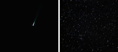
(American, b. 1974)The Last Pictures/EchoStar XVI Launch and Preliminary Orbit, 2012
C-prints
38 x 42 1/2 in.
The Alfond Collection of Contemporary Art, Gift of Barbara '68 and Theodore '68 Alfond, 2013.34.81 © Trevor Paglen
Paglen’s diptych The Last Pictures/EchoStar XVI Launch and Preliminary Orbit (2012) in effect documents his latest project, The Last Pictures. Developed over the course of four years in collaboration with artists, philosophers, and scientists, Paglen’s question was how to best summarize human history and culture, and then preserve it in such a way as to outlast Earth itself. His solution was to select 100 representative photographic images, some shot by the artist, but most sourced from archives. These photographs were micro-etched onto a silicon disk that was encased in a gold-plated medallion. This high-tech artifact was attached to an EchoStar communications satellite that launched from the Baikonur Cosmodrome in Kazakhstan. Its orbit is 18 times farther from Earth than that of most satellites, guaranteeing that The Last Pictures will be preserved in perpetuity. With The Last Pictures, Paglen presents us with a conceptual and visual framework through which to question the power and pervasiveness of science and technology, and to consider the inadequacy of the photographic record as a means of fully representing or finally explaining what it is to be human.
--Alison J. Hatcher
Trevor Paglen
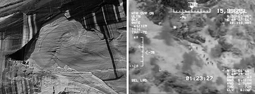
(American, b. 1974)The Last Pictures (The Narbona Panel; Humans Seen Through a Predator Drone), 2012
Gelatin silver prints
24 x 32 in.
The Alfond Collection of Contemporary Art, Gift of Barbara '68 and Theodore '68 Alfond, 2013.34.80 © Trevor Paglen
Trevor Paglen
(American, b. 1974)Untitled (Reaper Drone), 2012
C-print
48 x 60 in.
The Alfond Collection of Contemporary Art, Gift of Barbara '68 and Theodore '68 Alfond, 2013.34.82 © Trevor Paglen
The resulting photographs of things not meant to be seen — satellites against heavenly constellations or dizzily orbiting through space — are formally, aesthetically, and authentically awesome. In Untitled (Reaper Drone) (2012), a drone is barely visible in the abstract vastness of the light blue sky fading to orange. Paglen’s photographs capture the terrifyingly indiscriminate nature of high-tech warfare, highlighting the slippery line between the government’s desire for secrecy and the public’s right to knowledge.
--Alison J. Hatcher
Trevor Paglen
(American, b. 1974)"Fanon" (Even the Dead Are Not Safe) Eigenface, 2017
Dye sublimation metal print
49 4/8 x 49 5/8 x 2 in.
The Alfond Collection of Contemporary Art, Gift of Barbara '68 and Theodore '68 Alfond, 2017.6.50. © Trevor Paglen
Trevor Paglen
(American, b. 1974)"Weil" (Even the Dead Are Not Safe) Eigenface, 2017
Dye sublimation metal print
48 5/8 x 48 5/8 in.
The Alfond Collection of Contemporary Art, Gift of Barbara '68 and Theodore '68 Alfond, 2017.6.51 © Trevor Paglen
Gordon Parks
(American, b. 1912-2006)Untitled, Shady Grove, Alabama, 1956
Archival pigment print
50 x 50 in.
The Alfond Collection of Contemporary Art, Gift of Barbara ’68 and Theodore ’68 Alfond. 2020.1.4. Courtesy of and copyright The Gordon Parks Foundation
Claudio Parmiggiani
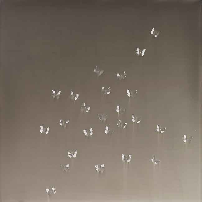
(Italian, b. 1943)Untitled, 2014
Smoke and soot on wood
59 1/16 x 56 1/16 in.
The Alfond Collection of Contemporary Art, Gift of Barbara '68 and Theodore '68 Alfond, 2015.1.14. Image courtesy of the artist and Bortolami, New York.
Rachel Perry
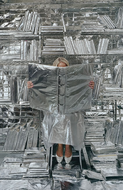
(American, b. Japan, 1962)Lost in My Life (Wrapped Books), 2010
Pigment print
90 x 60 in.
The Alfond Collection of Contemporary Art, Gift of Barbara '68 and Theodore '68 Alfond, 2013.34.119. © Rachel Perry. Image courtesy of the artist and Yancey Richardson Gallery.
Rachel Perry creates obsessive, repetitive, and process-based art about the routines of her daily life—what she considers “the business of living.” She often uses humor to address the anxieties of modern living and parenting, with themes that include consumerism, suburbia, narcissism, information overload, the passage of time, and ultimately, life and death.
As a Conceptual artist, Perry holds no allegiance to a particular medium. She utilizes whatever methods or materials best communicate her idea, including video, collage, photography, sculpture, social media, and performance. These disparate practices are unified by an interest in investigating language and systems, and a visual aesthetic that combines the spare precision of Minimalism with the vivid color and irony of Pop Art.
Perry takes daily life as her subject, incorporating the banal and the extraordinary in equal measure. She appropriates the material that annoyingly, and sometimes mistakenly, inundates our lives as her subject, including spam emails, wrong-number voice messages, receipts, twist ties, aluminum foil wrappers, Facebook updates, and even Muzak. The disposable minutiae of life are collected, organized, and transformed in poignant and visually surprising ways that uncover the poetic in the everyday.
In her ongoing photographic series, Lost in My Life, Perry mines her collection of treasures to create dazzlingly dense stage sets for self-portrait photo shoots. In the case of Lost in My Life (wrapped books) (2010), books bound in a shiny layer of aluminum foil provide a glittering backdrop for an obscured shot of Perry herself. Dressed in similarly reflective clothing, her face blocked by a lovingly foiled oversized album, Perry is consumed in a sea of preservative products. Commonly used to prolong the life of our leftovers, the foil is used here to protect and ensure the life of the artist, her library, and by extension, our larger literary heritage. As our obsession with electronics rapidly renders physical libraries obsolete, Perry’s Lost in My Life (wrapped books) stands as a poetic homage to the fragile life of the book.
--Lexi Lee Sullivan
Jaume Plensa
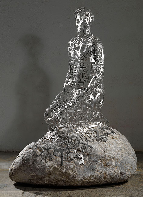
(Spanish, b. 1955)The Hermit XI, 2012
Stainless steel and stone
68 29/32 x 53 35/64 x 37 1/64 in.
The Alfond Collection of Contemporary Art, Gift of Barbara '68 and Theodore '68 Alfond, 2013.34.34. © Jaume Plensa. Image courtesy of the artist and Galerie Lelong, New York.
Since the 1980s, Jaume Plensa has been working with the human form. His sculptural bodies, whether emerging from the landscape or perched on stones, are instantly recognizable. The shape of his figures––with their smoothly rounded heads, soft postures, and simplified features––remains consistent across his oeuvre. Working in a wide variety of materials, including cast iron, marble, concrete, and stainless steel, Plensa returns again and again to the subject of the body as metaphor and frame. From a towering 44-foot resin and marble head installed in Madison Square Park, New York, in 2011 to the crouching bodies in Figures Representing Seven Continents (2007), Plensa uses the abstracted body to address broad questions in the public arena.
The figure in The Hermit XI (2012) is no exception. Molded from a thin steel skin comprised of letters taken from eight alphabets, the human body is traced with great economy. The kneeling figure is draped over a stone sourced from Plensa’s native Spanish Pyrenees. Contemplative and solitary, the figure inhabits a world of its own. The cool precision of the cut steel and the roughness of the stone coexist in discordant harmony; the abstraction and universality of the alphabet meet the irreducible materiality of the human body.
Though the hermit’s identity suggests isolation, his body is composed of the components of words. Language being inherently social, he calls for an interlocutor: the plurality of alphabets suggests that while he may speak to anyone, everyone will read him differently. The meditation on language is resonant with Plensa’s Catalan roots: caught between a desire to retain their unique language and a need to communicate with the larger Spanish nation, the Catalans exemplify the dilemma of the contemporary global citizen. In addressing the tensions between the local and the global, and creating a site for discourse, The Hermit XI, then, offers a model for a complex and nuanced sense of humanity.
--Kelly Presutti
Deborah Poynton
(South African, b. 1970)Predicament, 2022
Oil on Canvas
98 3/8 x 74 ¾ in.
The Alfond Collection of Contemporary Art, Rollins Museum of Art. Gift of Barbara ‘68 and Theodore ‘68 Alfond. 2022.2.13 © The artist. Courtesy of Stevenson, Cape Town, Johannesburg and Amsterdam
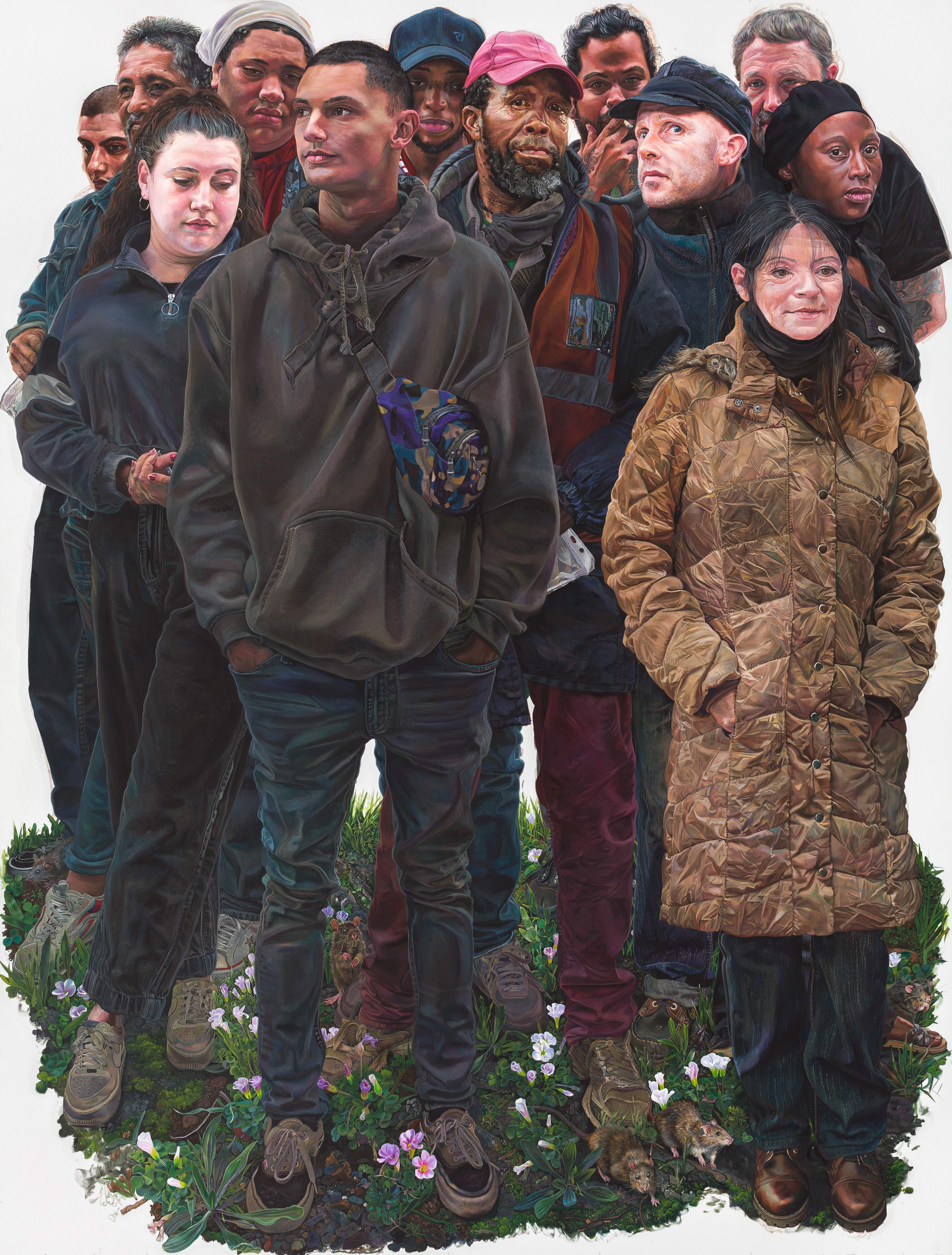
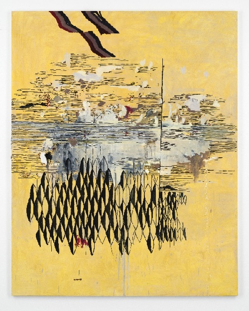
South African artist Deborah Poynton is best known for her hyper-realistic paintings depicting her friends and family in imaginary situations. From a young age Poynton used art as a way to create a safe world for herself. As an adult, the act of painting provides her with an avenue to think about and escape from real life. Her large-scale compositions emphasize the physical aspect of the work allowing the viewer to feel as though one could step into the painting. The realism with which Poynton depicts figures and objects encourages viewers to project their own feelings and narratives onto the scene although she has expressed that her works have no specific meaning. Through her invented scenarios Poynton plays with perception and makes viewers aware of the filter through which they view life.
Pawel Przewlocki
(Polish, b. 1984)Bambi & Davis, 2014
Oil and acrylic on panel
36 x 20 in.
The Alfond Collection of Contemporary Art, Gift of Barbara '68 and Theodore '68 Alfond, 2015.1.5. © Pawel Przewlocki. Image courtesy of the artist.
Pawel Przewlocki
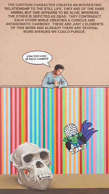
(Polish, b. 1984)Mojo & Kelly, 2014
Oil and acrylic on panel
36 x 20 in.
The Alfond Collection of Contemporary Art, Gift of Barbara '68 and Theodore '68 Alfond, 2015.1.6. © Pawel Przewlocki. Image courtesy of the artist.
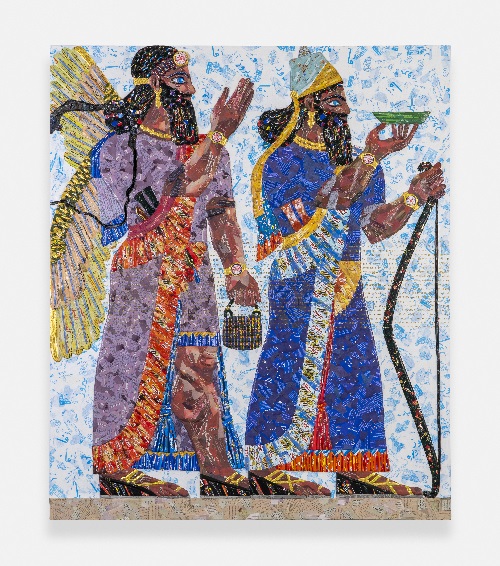
Michael Rakowitz
(Iraqi-American, b. 1973)The invisible enemy should not exist (Room H, Northwest Palace of Nimrud) H-13, 2019
Middle Eastern food packaging and newspaper with glue panel
90 35/64 x 76 3/8 in.
The Alfond Collection of Contemporary Art, Gift of Barbara ’68 and Theodore ’68 Alfond, 2021.1.34 © Michael Rakowitz
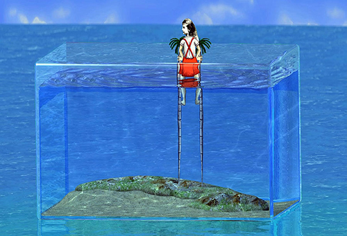
Sandra Ramos
(Cuban, b. 1969)Aquarium, 2013
3D video animation
The Alfond Collection of Contemporary Art, Gift of Barbara '68 and Theodore '68 Alfond, 2014.01.2. Image courtesy of the artist.
Cuban artist Sandra Ramos’s work enters the Alfond Collection of Contemporary Art at a historically significant moment for Cuba: after a nearly fifty-year embargo between the island nation and the US, diplomatic relations have resumed. Ramos thematized the nation’s decades of isolation in her 2013 animated video Aquarium. The video opens with an image of the globe but quickly zooms in on the island of Cuba, depicted as a patch of sand in a glassed-in box within the larger ocean. The main character in the work is a small girl whom Ramos has identified as herself. We find her stretched out across the island, palm trees sprouting from her body, metaphorically evoking Ramos’s intimate relationship with her home.
The girl is loosely based on Alice in Wonderland: a young, naïve, inquisitive figure whom we follow into the strange depths of the unknown. By depicting herself as the curious Alice, Ramos introduces a wondrous perspective alongside the work’s political seriousness. This playfulness is repeatedly undercut, however, as the girl’s efforts often end in failure or misfortune: when watching television, she is pulled into the set; she climbs up tree trunks to peek over the glass only to fall back down; she raises a Cuban flag, but it quickly blows away. Towards the end of the video, Ramos introduces a photograph of a crowd. The image swells and bursts the glass walls of the aquarium, evoking the power of the populace, but in the next scene the island appears little changed.
--Kelly Presutti
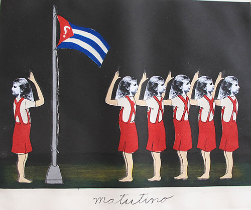
Sandra Ramos
(Cuban, b. 1969)Matutino, 2010
Etching aquatint on paper
19 11/16 x 23 5/8 in.
The Alfond Collection of Contemporary Art, Gift of Barbara '68 and Theodore '68 Alfond, 2014.1.14. Image courtesy of the artist.
This mixture of whimsy and tragedy is characteristic of Ramos’s oeuvre, which often uses surreal images to convey a political message. The Alice avatar reappears in the artist’s 2010 print Matutino. Now multiplied, the six figures line up before a flagpole, saluting but facing away from it. The star of the Cuban flag has been replaced by a question mark. The scene evokes a schoolyard, a place of innocence, but the message is more cutting. Ramos represents her simultaneous affection for her country and her uncertainty regarding its political future, an ambivalence that resonates across her oeuvre.
--Kelly Presutti
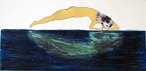
Sandra Ramos
(Cuban, b. 1969)Narcisus (Narcissus), 2012
Etching aquatint
19 11/16 x 39 3/8 in.
The Alfond Collection of Contemporary Art, Gift of Barbara '68 and Theodore '68 Alfond, 2014.1.15. Image courtesy of the artist.
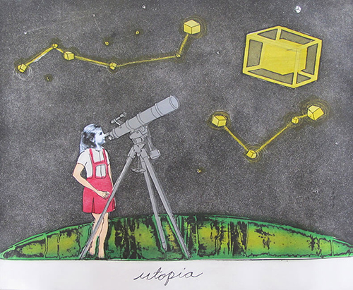
Sandra Ramos
(Cuban, b. 1969)Utopia, 2010
Etching aquatint
19 11/16 x 23 5/8 in.
The Alfond Collection of Contemporary Art, Gift of Barbara '68 and Theodore '68 Alfond, 2014.1.13. Image courtesy of the artist.
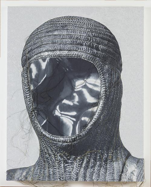
Pedro Reyes
(Mexican, b. 1972)Flat Statues (Lose Face), 2016
Photographic print on canvas and collage
37 3/8 x 37 3/8 in.
The Alfond Collection of Contemporary Art, Gift of Barbara '68 and Theodore '68 Alfond, 2017.6.35. © Pedro Reyes. Image courtesy Lisson Gallery.
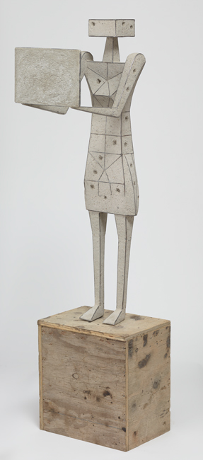
Pedro Reyes
(Mexican, b. 1972)Protester I, 2016
Steel and concrete
45 1/8 x 12 5/8 x 11 in.
The Alfond Collection of Contemporary Art, Gift of Barbara '68 and Theodore '68 Alfond, 2017.6.36. © Pedro Reyes. Image courtesy Lisson Gallery.
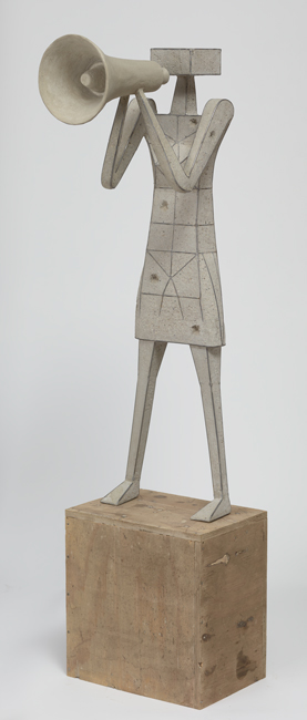
This group sculpture by Mexican artist Pedro Reyes emphasizes the power in coming together for a common cause. Completed in 2017, amidst social and political changes in the US and abroad, the work evokes the images of protests and demonstrations that circulated in the news and on social media. Alone, each protester is striking, but brought together the series displays forms of protest that engage both the visual and auditory senses. The lack of individual features underscores the collective characteristic of public protest, while the empty signs invite viewers to imagine their own slogans in support of the causes that are important to them.
Pedro Reyes
(Mexican, b. 1972)Protester II, 2016
Steel and concrete
45 1/8 x 12 5/8 x 11 in.
The Alfond Collection of Contemporary Art, Gift of Barbara '68 and Theodore '68 Alfond, 2017.6.37. © Pedro Reyes. Image courtesy Lisson Gallery.
Pedro Reyes
(Mexican, b. 1972)Protester III, 2016
Steel and concrete
45 5/8 x 19 5/8 x 9 7/8 in.
The Alfond Collection of Contemporary Art, Gift of Barbara '68 and Theodore '68 Alfond, 2017.6.38. © Pedro Reyes. Image courtesy Lisson Gallery.
Pedro Reyes
(Mexican, b. 1972)Protester IV, 2017
Steel and concrete
54 3/4 x 11 3/4 x 11 3/4 in.
The Alfond Collection of Contemporary Art, Gift of Barbara '68 and Theodore '68 Alfond, 2017.6.40. © Pedro Reyes. Image courtesy Lisson Gallery.
Marina Rheingantz
(Brazilian, b. 1983)Zebra, 2017
Oil on canvas
98 1/2 x 78 3/4 in.
The Alfond Collection of Art, Gift of Barbara '68 and Theodore '68 Alfond, 2018.1.15. Image courtesy of the artist and Bortolami, New York
Robin Rhode
(South African, b. 1976)Evergreen, 2016
C-prints
23 x 28 19/32 in.
The Alfond Collection of Contemporary Art, Gift of Barbara '68 and Theodore '68 Alfond, 2017.6.45. © Robin Rhode. Image courtesy of the artist and Stevenson, Cape Town and Johannesburg.
Daniel Rich
(German, b. 1977)Athens, 2017
Acrylic on dibond
80 x 80 in.
The Alfond Collection of Contemporary Art, Gift of Barbara '68 and Theodore '68 Alfond, 2018.1.9. Image courtesy of the artist and Peter Glum Gallery, New York.
Daniel Rich
(German, b. 1977)Stadium, 2012
Acrylic on dibond paper
81 x 59 in.
The Alfond Collection of Contemporary Art, Gift of Barbara '68 and Theodore '68 Alfond, 2013.34.92. Image courtesy of the artist and Peter Blum Gallery, New York.
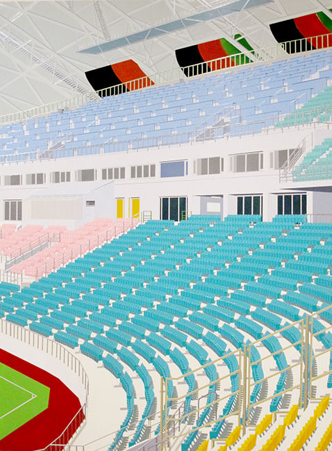
Daniel Rich’s paintings investigate the link between architecture, nationalism, and power. After intuitively scouring newspapers, films, and Google images, Rich bases his works on pictures of real-life structures that symbolize the international race for global domination.
Rich has painted hotels, communication towers, iconic government buildings, computer servers, and, in this piece, a stadium. They are symbols of, and platforms for, power; all part of a delicate international system. Though Rich selects to depict structures that are expensive and difficult to construct, they are also easy to topple, attack from above, or unplug—quick actions that would create a chain reaction affecting economies worldwide.
Rich’s use of media imagery exists in the legacy of Pop Art. Andy Warhol’s appropriation in the early 1960s of a newspaper image of an electric chair triggered future generations to borrow media imagery, remove its context, and alter its meaning. The architectural works of pioneering California conceptualist Ed Ruscha applied the deadpan sensibility of Pop to structures familiar to all Americans, such as gas stations, and to the iconic West Coast institution the Los Angeles County Museum of Art. Both artists employed Pop’s method of choice: silk screening, a technique whose smooth surfaces, ability to create sharp edges, and lack of visible gesture all generate an unnerving calm.
While traditional silk screening uses ink, Rich’s method merges silk screen technique and painting tradition. His creamy smooth, painstakingly precise works result from a complex and labor-intensive process of hand-cutting stencils, mixing hundreds of related shades of paint, and applying it with a paper squeegee. The final product is sheer surface seduction. Small areas of brushwork that reveal his hand contrast with the hard-edged areas of rich, flat color. Rich’s stylized palette further challenges expectations about his imagery.
Stadium (2012) depicts Japan’s Ōita Bank Dome, a structure with a 43,000-person capacity that has hosted some of the world’s largest sporting events, including the 2002 FIFA World Cup. When a country competes for and hosts such a high-profile multinational sporting competition, it projects a message of power and relevance, putting their nation on the global stage. As in all of his work, Rich’s stadium is devoid of people. His choice to dramatically crop the image and to omit the name and location from the title renders the Ōita Bank Dome merely a symbol of the ability of architecture to impact the world’s balance of power.
--Al Miner
Daniel Rich
(German, b. 1977)Study for Amazon Warehouse, 2013
Spray enamel on paper
18 x 16 in.
The Alfond Collection of Contemporary Art, Gift of Barbara '68 and Theodore '68 Alfond, 2013.34.150. Image courtesy of the artist and Peter Blum Gallery, New York.
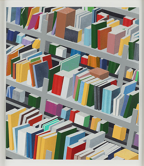
In Study for Amazon Warehouse, Daniel Rich explores the aesthetics of power through juxtaposing a symbol of scholarship and an embodiment of a colossal and lucrative system of distribution—Amazon’s warehouse. Throughout his practice, Rich re-imagines physical structures of dominance and authority through a lens of visual simplicity. In his stylized depictions of buildings’ interiors or façades, he exposes the social, political, and economic implications underlying their forms and functions. In this study for a much larger work, he portrays one of the company’s fulfillment centers not as a disseminator of knowledge but as a conduit of commodities. Details have been airbrushed away by Rich’s use of spray enamel on paper, and only bright, uniformly toned colors remain. Although the books vary in size, hue, and precise placement and angle, they have neither titles on their spines nor text on their covers. The units of shelving look similarly identical. Rich downplays detail in order to highlight the larger system of commercial transaction at play.
The serial imaging of the books and shelving in Rich’s work also recalls Andy Warhol’s silk-screened canvases with sequential portraits of celebrities like Marilyn Monroe. As Warhol’s work spoke to his generation’s over-exposure to mass-media images, Rich’s Study for Amazon Warehouse likewise speaks to the massive quantity of manufactured products inundating today’s world. In emphasizing the quantity of things contained within an economic powerhouse that caters to the voracious consumption of such goods, Rich addresses the thirst for commodities in contemporary society. The succession of brightly colored spines in Rich’s image evokes the vast number of books in the warehouse, and the collapsed perspective further constructs the illusion that Amazon’s repository is filled to the brim. Rich’s cropping of the image, although in part due to the fact that it is a small study for a larger piece, hints at the space beyond the frame. The suggestion that the shelves continue in perpetuity conveys the immensity and pervasiveness of the company’s power.
Rich’s nod to the earlier artistic tradition of precisionism confirms a sense of equivocality towards the subjects in his work. The clean, smooth lines of his composition are reminiscent of those that appear in the canvases of early twentieth-century artists such as Georgia O’Keeffe and Charles Sheeler, who depicted the sleek forms of their modern, industrial reality. Yet these precisionist canvases did not necessarily celebrate that reality. Beneath the streamlined neatness, anxiety or apprehension often lurked. Evoking this tradition, Rich’s work similarly conveys unease with particular aspects of contemporary life. Ultimately, the bookshelves in Study for Amazon Warehouse seem unnaturally still, as if the chaos of over-consumption could erupt at any moment.
--Laura Beshears
Michael Riedel
(German, b. 1972)Untitled (Comb Vertical), 2013
Silkscreen on linen
90 1/2 x 67 x 2 1/4 in.
The Alfond Collection of Contemporary Art, Gift of Barbara '68 and Theodore '68 Alfond, 2013.34.30. © Michael Riedel. Image courtesy of David Zwirner, New York/London
Michael Riedel is interested in the production of data and the tools that structure communication. He interrogates the means by which information is generated and delivered, most recently fixing his attention on PowerPoint––the ubiquitous presentation tool used by students and professionals. For areas from biochemistry to business, the medium seems to offer a straightforward format for communicating almost anything. Yet we rarely question the particularities of the program and the way our thinking may be influenced by its operation.
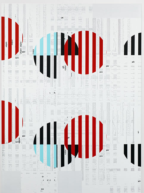
Building on an earlier series titled Poster Paintings, Riedel’s PowerPoint series takes the often-gimmicky transitions between PowerPoint slides (fade, wipe, reveal) as a point of departure. Drawing on the legacy of appropriation and collage, Riedel literally merges two of his Poster Paintings and depicts the midpoint of their integration. Just as in the passage between two PowerPoint slides, forms start to disintegrate and new images begin to surface, producing a dynamic graphic representation of content in motion. By using the PowerPoint system to determine the form of his work, Riedel cedes control over the final product and demonstrates that the information itself is secondary to its delivery.
This process is made visible in Untitled (Comb Vertical) (2013). The piece is an amalgamation of two Poster Paintings that Riedel exhibited at David Zwirner in 2011. The text for these posters was, in turn, taken from internet descriptions of Riedel’s earlier artworks. This complex series of derivations generates a Duchampian infinite regression: work about work about work. Riedel’s practice concerns the questions central to all conceptual art: do we focus on the initial gesture, the process of transformation, or the material object that results?
In looking at the systems that support information flow, Riedel borrows the strategies of institutional critique used by artists such as Hans Haacke, Marcel Broodthaers, and Andrea Fraser. These practitioners sought to expose the ways art institutions controlled and restricted the kind of art that was exhibited and the ideological bases for these manipulations. Riedel’s practice demonstrates the extent to which our attention has shifted away from the work itself to its mode of communication. Although Untitled (Comb Vertical) contains an abundance of text, its illegibility serves as a critique of the emptiness of communication today, despite, or perhaps because of, its ubiquity.
--Kelly Presutti
Marco Rios
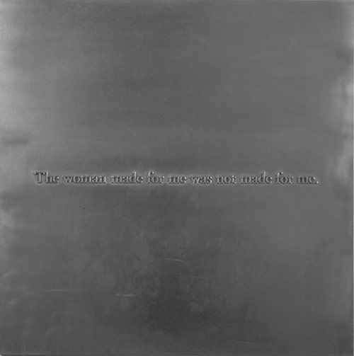
(American, b. 1975)The Woman Made For Me Was Not Made For Me, 2013
Photo engraving on metal
20 x 20 in.
The Alfond Collection of Contemporary Art, Gift of Barbara '68 and Theodore '68 Alfond, 2013.34.102. Image courtesy of the artist and Simon Preston, New York.
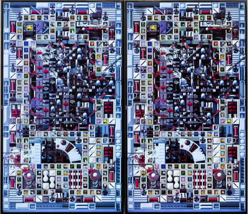
Tabor Robak
(American, b. 1986)Dog Park, 2015
Custom-built PC with generative computer animation
66 1/2 x 34 in.
The Alfond Collection of Contemporary Art, Gift of Barbara '68 and Theodore '68 Alfond, 2016.3.19. © Tabor Robak. Image courtesy Team Gallery Inc., New York and Los Angeles.
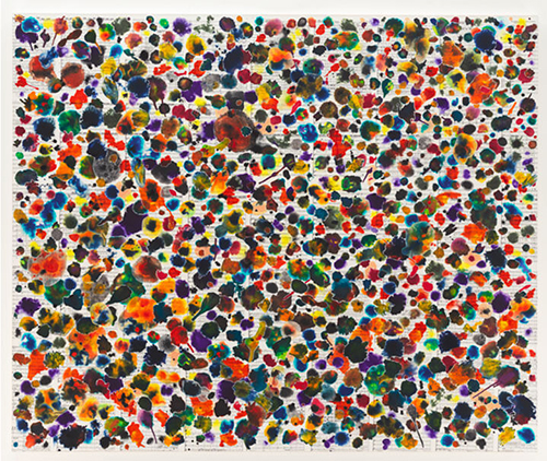
Tim Rollins and K.O.S.
(American, 1955-2017)A Midsummer Night's Dream (after Shakespeare and Mendelssohn), 2011
Watercolor, india and acrylic inks, Thai mulberry paper, collage, mustard seed, offset lithography on music score pages on canvas
60 x 72 in.
The Alfond Collection of Contemporary Art, Gift of Barbara '68 and Theodore '68 Alfond, 2013.34.72. © Tim Rollins and K.O.S. Image courtesy of the artist and Lehmann Maupin, New York and Hong Kong.
Since the early 1980s, Tim Rollins and K.O.S. (Kids of Survival) have been collaborating and spreading the gospel that art is a pathway to knowledge. Rollins’s enduring partnership with K.O.S. is an example of social practice at its most meaningful and effective.
The story of how K.O.S. came to be starts with Rollins’s serendipitous appointment as the special education art teacher for Intermediate School 52 in the South Bronx. Rollins initially arrived at I.S. 52 for a two-week project, but by the end of his first day in 1981, he had been hired for a full-time position. So began his mission-driven life’s work—to collaborate, to reveal the enlightening power of art, and to make meaningful and aesthetic artwork, all while bettering the lives of others.
Born in Maine, Rollins attended the University of Maine at Augusta in the mid-1970s. At this time he discovered Germano Celant’s Arte Povera and thereby the work of Joseph Kosuth, who was included in the catalogue. Rollins would go on to study with Kosuth at the School of Visual Arts in New York, and even became his assistant. Rollins’s foundational relationship with Kosuth can be partly credited for his long engagement with text; reading and study were always the jumping-off point for K.O.S. projects. However, Rollins & K.O.S. did not start actually marking and painting directly on book pages and music scores until Rollins saw one of the student’s drawings in a book and something clicked. Suddenly, the students’ personal development through the layering of new information and experience could find apt expression in the layering of material and gesture.
A Midsummer Night's Dream (after Shakespeare and Mendelssohn) (2011) beautifully demonstrates the Rollins & K.O.S. method of working. Here the artists have layered pages of Mendelssohn’s sheet music for A Midsummer Night’s Dream, which they had studied in tandem with Shakespeare’s play, and upon which they collaged ethereal floral elements and tiny appliquéd mustard seeds. The floral motif came to prominence for this series of paintings when Rollins found a quote in Theseus’s monologue in A Midsummer Night’s Dream, which Rollins says was the “best definition of art…in the English language…and it soon became obvious that [the paintings] had to include the flower; this flower has magic nectar with the power to make you fall in love with the next living thing you see upon awakening.”[1] The work of Rollins & K.O.S. similarly courts the viewer, and through the artists’ unification of content, image, and human spirit makes us—much like Shakespeare’s characters—swoon on a midsummer night.
--Abigail Ross Goodman
[1] Ian Berry, editor, Tim Rollins and K.O.S.: A History, exh. cat. (Saratoga Springs, NY: The Frances Young Tang Teaching Museum and Art Gallery, Skidmore College; Cambridge, MA/London: MIT Press, 2009), 245.
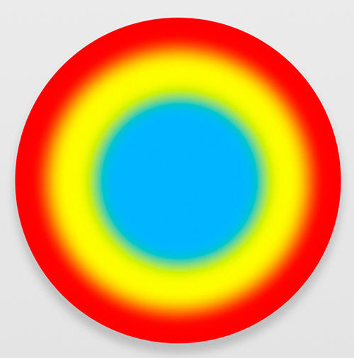
Ugo Rondinone
(Switzerland, b. 1964)Dreizehnteraprilzweitausendundsechzehn, 2016
Acrylic on canvas
31 1/2 x 31 1/2 in.
The Alfond Collection of Contemporary Art, Gift of Barbara '68 and Theodore '68 Alfond, 2017.6.34. © Ugo Rondinone. Image courtesy of the artist and Gladstone Gallery.
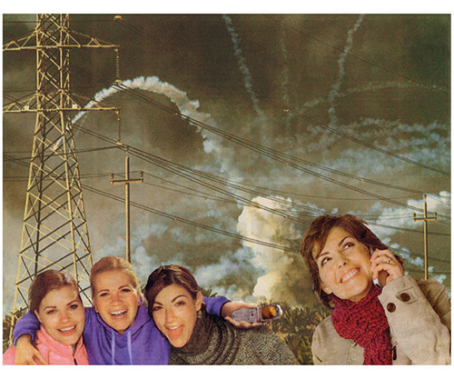
Martha Rosler
(American, b. 1943)Cellular, 2007
Photomontage
20 3/4 x 24 3/4 in.
The Alfond Collection of Contemporary Art, Gift of Barbara '68 and Theodore '68 Alfond, 2013.34.83. Image courtesy of the artist and Mitchell-Innes & Nash, New York.
Martha Rosler began making art in the late 1960s at the start of that era’s feminist and anti-war movements, and she has used photography, text, video, and performance to develop incisive social and political critiques. Between 1967 and 1972, Rosler made a series of photo collages entitled Bringing the War Home, in which she inserted images of the Vietnam War into middle-class American interiors taken from the magazine House Beautiful. Around the apparently oblivious female inhabitants, explosions and scenes of combat appear through the windows and doorways of their placid suburban homes, and Marines crawl on their plush carpets. Her technique has its roots in German Dadaist photo collage—the work of artists like Hannah Höch and John Heartfield—which sought to capture the nonsensical horror of the First World War. After the start of the Iraq War, Rosler reprised her Bringing Home the War series in 2004, clipping images from American advertisements and fashion magazines and placing them in war-torn Iraq. A model in an evening gown struts past a U.S. tank and a group of Iraqis, and, in another image, a repeated female figure sprays Febreze on a comfy living room set in Saddam's ravaged palace. By placing these women into war scenes rather than domestic ones, Rosler goes beyond the naïveté that characterized the women in her first series to add an element of complicity.
In Cellular (2007), Rosler cuts images of smiling women holding cellular phones from magazine advertisements and sets them in a wartime landscape. The four women in the foreground appear wholly unaware of the falling bombs and explosions that make up the smoke-filled background, and telephone wires crisscross the middle ground. Through both the imagery and the title, Rosler draws attention to the cell phone and perhaps to its sanctioned and unsanctioned uses in the contemporary age of war. It is so often via cell phone imagery that the acts of war become more broadly known and that citizens become journalists. These women, however, appear disconnected—both visually and emotionally—from the events behind them. In our super-saturated media environment, images rarely shock. Or perhaps we are just too distracted to take notice—always looking and not looking, listening and not listening. As trenchant as ever, her photo collages make visible the frequent disconnect between life in the U.S. and in places where the U.S. continues to be involved in conflict.
--Ruth Erickson
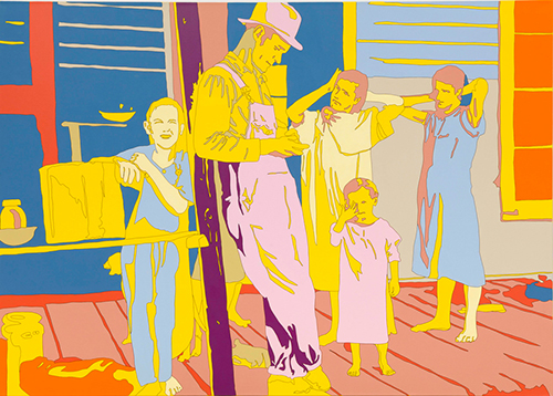
Francis Ruyter
(American, b. 1968)Walker Evans: Floyd Burroughs and Tengle Children, Hale County, Alabama, 2011
Acrylic on canvas
59 1/16 x 82 43/64 in.
The Alfond Collection of Contemporary Art, Gift of Barbara '68 and Theodore '68 Alfond, 2015.1.32. Image courtesy of the artist
